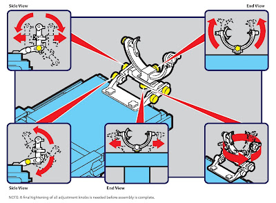
Maybe you heard about the massive recall last week of 951,000 home improvement books by Oxmoor House, Inc. due to errors in the technical diagrams and wiring instructions that could lead consumers to incorrectly install or repair electrical wiring, posing an electrical shock or fire hazard to consumers. Since we’re in the instruction business, this news obviously caught our attention and got us thinking that perhaps most manufacturers and publishers don’t factor “recalls” into their product profitability projections.
It also prompted us to do a quick internet search to see if any other instructions had been recalled. According to the U.S. Consumer Product Safety Commission, just a year prior 64,000 Wiring a House instructional books published by Taunton Press were recalled for the very same reasons. Additionally, within the past year 18,000 illuminated round rocker switches sold by RadioShack Corp., were recalled because the wiring diagram on the switch’s package showed the neutral and line notation was reversed, posing a shock hazard to consumers. Stamina Products recalled 11,000 elliptical machines and modified the warning/assembly instructions in the owner’s manuals to emphasize that the elliptical pedal shafts must be securely tightened to the cranks. If not securely tightened, the pedal shafts could become loose from the cranks, which could result in serious injury to the user.
Our experience has shown that many companies fail to calculate, track or, even consider the cost of the risks they take by under-valuing the importance of the quality of their instructions. Risks that can take away those profits (for instance by recalls, unnecessary customer service calls) and result in the loss of market share, and more.
Many of our potential clients simply don’t budget enough money or time for their instructions (they seem to be an “afterthought” in the product development and launch schedule) and opt to spend the bulk of their money on sales support material. We understand that they are in the business to make money and selling the products is paramount to that concept. On the flip side, recalls like these are just one of many financial risks of underestimating the value of producing accurate and comprehensive instructions.
Why these particular instances happened and how these folks address it in the future must be identified before they can be avoided. It’s possible these “mistakes” stem from the lack of quality control and accuracy check points or the lack of physical testing of the instructions by actual users to verify them as accurate and safe.
Instruction manuals (and how-to books) continue to be, for many manufacturers, a requirement on which they invest a minimal amount of their product’s cost. For these publishers, the problem may have stemmed from common assumptions—the content and copy were fact-checked and proofread for spelling and grammar—the illustrators followed the experts' lead—therefore it must be right.
So what’s the answer? Hire the instruction experts? Partner with Infographics and they’ll do everything flawlessly? Now that’s a pretty big claim, and not one that many humans can or should make. What Infographics can offer are processes and collaborative ideas to substantially LOWER the risks of mistakes. We first recognize who the “content expert” is and it’s seldom us. Our niche is creating the means to communicate to other “non-experts”. We respect the manufacturer, engineer, product designer, scientist, inventor, researcher or writer (content experts) who provide the facts. We then respectfully challenge them and their content IF we don’t understand it ourselves right away. Combined with our skills in creating effective visual and verbal instructions, we can substantially lower the risks of mistakes.
Yes, we realize the experts know more than we do about their product/content, but WE need to understand it on our level to effectively communicate it to the audience who, like us, often does not have the expertise of the manufacturers and engineers. Once the content experts and our team come to an understanding based on our mutual respect of what we both do, the process begins.
We collaborate and create content for the end-users they can relate to and understand, and not necessarily in the way our experts can relate to all the time. To assure accuracy, both sides (experts/Infographics) stay intimately involved in making sure the content is accurate no matter how it is communicated—continuously pushing back on each other to make the information clear and accurate.
For the best results, we have our solutions checked by giving the instructional piece to a sampling of the targeted audience (by far the most important people in our process) to try to use and then critique.
The bottom line: Lowering the risks of recalls or injuries takes an investment too few are willing to make upfront. These recent recalls are examples of what NOT making adequate investments in instructions can cost for those who don’t.
 Knoxville businesswoman and Infographics' client Jill Quillin will appear on Friday's episode of ABC's reality series "Shark Tank." Quillin is the developer of LipStix Remix, which allows someone to mix colors and make a new tube of lipstick or combine old used tubes into one new full size tube.


