Friday, December 3, 2010
Wednesday, November 24, 2010
Gratitude for a Winning Partnership
I spent years designing pieces and campaigns that were clever and aesthetic, and perhaps even a bit uniquely creative from time to time. Now I’m in the business of creating pragmatic solutions that visually communicate information people can actually use, need and appreciate. Our company specializes in communicating “how-to” information, mostly for major manufacturers of consumer products. Our small, but talented, team of information designers creates practical, yet aesthetic, visuals that are logically organized and targeted for the user, either in print, online or any medium.
Sure, I miss the creative flair and cache of marketing and advertising pieces. The kudos you get doing WOW graphics and glamorous photo shoots. But now I’m doing work the real consumer in me missed having for years and years—technical communication products (instructions, user manuals) that the typical consumer (like me) can understand and use.
As a consumer, I often lost the joy of buying a new product once I opened the box. Why? I became frustrated with myself because the instructions left me feeling inadequate and…well, just too stupid to understand how to use, assemble or care for my brand new purchase! Information and data were given to me, sometimes in massive amounts, all assuming I should be able to follow it, understand it and enjoy my purchase. Sound familiar?
Many times it took me forever to understand the instructions. I wasn’t able to use my product immediately or actually USE all the features. Or even worse, I would put it together wrong and then reassemble it, wasting more time! I felt like a loser. In time, I came to the conclusion, “It’s NOT ME; it’s THEM!” Themmeaning the manufacturer, the product engineers, the technical writers, the product managers, and the CEOs, who refused to recognize the need to translate their proprietary data and languages into simple language that would actually communicate on my level as a consumer.
They were what I referred to as Product Elitist (OK, and worse) who really wanted to make me feel stupid while they used their internal knowledge and vocabulary to punish me and to demonstrate their superiority! And adding insult to injury, I paid money for the suffering. I bought into the marketing and didn’t return the products to avoid my own humiliation from my inability to understand the data! Aarrgh!!! And as I continued to create my own conspiracy theory against me—these same elitist, kept their jobs because no one in their organization was brave enough to admit or point out—THEY couldn’t understand them either!! As long as they could sell it and I was buying—they were OK with my suffering. That was my conspiracy theory and by God…I was sticking with it!
So, when I got the chance, I went into the business of trying to show them the errors of their ways, and guess what their first objection was? How much it cost! Providing documentation, instructions and helpful information their customers could understand, as a customer service, seemed to them TOO EXPENSIVE. Despite the fact it was a mere fraction of their marketing and advertising budgets to SELL us the goods and make us suffer through their proprietary jibber-jabber after the sale.
So, our little team began making our case on the value of doing a better job of communicating to customers in terms THEY could understand. Our case was based on reducing customer service calls, having fewer returns, and creating a loyal customer base that would buy more of products because of an improved ownership experience…things like that. Product manufacturers started, and continue, to come around thanks to my team’s hard work convincing them of the value of improved product information, companies seeing positive results…andan economy that tanked.
Yes, one good thing from the economy tanking is happening. Now that people have to spend their money more judiciously. They want MORE for their purchases. They want to be able to USE all the features. They want to ENJOY their new purchases faster with fewer hassles AFTER they take it out of the box. They want to LEARN about their products and not feel stupid trying to understand it. It really shouldn’t have been considered too much to ask for. But when times are good, hey what the heck, you can sell something for the label alone, right? We were glad to see some consumers finally woke up and manufacturers started caring.
Now that I’ve got this off my chest, I have a confession. I work with the very people I’ve sounded off about—and I LIKE working with them! My business and I depend on them for their expertise, input, and support. They are our partners and I respect their knowledge and enjoy their involvement. They’re vital to our success as a business and to the products we produce to communicate technical information specifically for the end-users.
Our goal is to EARN our clients’ respect and confidence by not completely recreating or glossing over their work or altering the accuracy and details required of it. Our job is to translate and communicate that information accurately and logically so that the masses can understand it, learn from it, and benefit from it.
Once that’s accomplished, the product development people that I once thought were conspiring against my fellow consumers and me, appreciate that we made sure all the work they put into their product and sweated over to develop for years is both used and appreciated by many more people. Then, a winning partnership between two very different disciplines is accomplished and everyone—from the people who invented and engineered the products, to the regular guy like me, who buys them—benefits.
Jim Kughler is general manager and president for Knoxville, Tennessee-based Infographics, a pioneer and leader in the development of innovative post-purchase product communications tools for consumer goods manufacturers. Jim began his career as a graphic designer after graduating from Indiana University. His 22 years of experience has covered the entire gamut of creative communications. From a graphic designer, to the manager of an in-house corporate graphic design studio he has experienced the process of corporate communications and marketing from the inside. From a sales representative in the emerging electronic age of printing and prepress in the 80’s to the late 90’s, to a director of sales over two teams in two states, Jim has spent his career providing design, sales and creative production consulting services to national brands such as: Philips, Magnavox, Philco, Sylvania, Rubbermaid, Yale, Sara Lee, Coca-Cola, TVA, Exxon-Mobil, Maytag, Meridian, Maxim, Trophy and Bayliner.
Friday, November 5, 2010
 | |
| Wordless Instructions by Infographics |
 | |
| Quick Reference Guide by Infographics |
Wednesday, October 20, 2010
More Tips for Delivering "Best in Class" Instructions
As the complexity of products continually increases, customers are placing the burden to explain how to use, maintain, and service products at the feet of manufacturers. Rather than instead of investing in professional communicators, this task is often left to the product engineer. Bear in mind that providing instructions or manuals to Joe Q. Public written in “engineer-speak” will most likely result in a frustrated customer.
Recognize documentation development is a crucial part of the product development lifecycle.
Interestingly, this is a marked departure from past practices in which documentation was addressed at the tail end of product development. As a general rule, it seems that product development schedules are seldom met. Therefore, if documentation is being addressed at the end of the development cycle, the need to introduce the product to market as quickly as possible can result in sacrifices in the planning and execution of the instructions. The best in class companies are incorporating documentation as another piece of the product development process allowing time for proper evaluation and analysis of the best manner to communicate to the end-user.
Visually communicate critical product information instead of forcing customers to read lengthy text.
Yes, it’s true. A picture is worth a thousand words. Data from our research confirmed more people understand concise, image based instructional or educational material than text-heavy collateral materials and engineering based images. Best in class companies recognize that visually based communication tools can decrease technical support and customer service calls as well as reduce product return rates. In addition, companies are realizing a reduction in the time and cost of localization because communicating with graphics instead of words reduces the amount of text there is to localize.
Are you ready to join the “best in class” companies when it comes to your product instructions and documentation? If so, call on the expertise of the team at Infographics.
Wednesday, October 13, 2010
Simple Product Instructions Make All the Difference
Rob Eddy, principal at Infographics, offers tips for improving instructions In 15-plus years of working closely with product designers, engineers and quality assurance professionals in many consumer-product industries, I’ve found that a critical factor affecting manufacturers’ success rests with how they value consumer opinions.
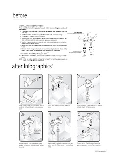 One oft forgotten but pivotal aspect of consumers’ product experience centers on instruction manuals for assembly, use and maintenance – or, what many people have grown to dread as incomprehensible directions that, in theory, are supposed to make a product work.
How many of us have struggled to the point of total frustration with archaic instructions offering no help whatsoever with a new product we’ve just purchased and anxiously await to use? The experience is practically universal – just ask any parent who has struggled until 4 a.m. Christmas morning with a child’s “some assembly required” toy.
The fact this consumer nightmare is so commonplace should tell all of us in product development fields that many companies are doing something wrong . . . specifically, failing to make a consumer’s initial product experience an enjoyable one.
Why should companies take notice? Consider these realities:
- Companies that offer clear, concise and well-written product instructions (also known as “post-purchase” communications tools) generally experience fewer product returns. Conversely, customers faced with poor instruction manuals sometimes decide that assembling a complicated product is not worth their trouble and demand their money back. (As a matter of fact, I worked with one company that was struggling with a 50 percent non-defective return rate because consumers could not understand how to install and use its product.)
- Manufacturers also reap benefits of lower customer call center demand when product communications provide inclusive information. In addition, good assembly and usage instructions offer a solid foundation for consumers and customer service agents to communicate – facilitating smoother and clearer support.
- For a company’s legal department, fewer product liability claims due to injury or poor performance arise when consumers correctly assemble, use and maintain their new purchase.
- In dealing with products distributed to international markets, manufacturers can also realize lower translation costs and less confusion across cultural boundaries when they employ proper use of universal symbols and understandable graphics.
- An improved brand perception often follows any company that makes the consumer’s assembly experience an easy and “painless” one. That brand perception can have residual effects, such as a consumer’s desire to purchase other products of the same brand or to recommend a brand’s products to friends.
- Better product instructions typically result in much better ownership experiences, which, at the end of the day, can easily parlay into increased sales, higher profitability and greater market share.
- Determine the appropriate department and specific manager(s) within your company to guide product communications. Frequently, tight product launch schedules and a lack of clearly defined responsibility can lead to hastily developed post-purchase communications tools. Establishing ownership for the development of these components can make a significant difference.
- Communicate internally with other managers and functions to gain buy-in across departments. Quality assurance and customer service functions most often deal with shortcomings in the area of “post-purchase” communications. However, these functions seldom lend input on creating these tools; instead, usually product development, marketing and/or engineering drive instruction manual development. By establishing cross-functional teams and collecting multiple perspectives interdepartmentally, companies can enhance product manuals significantly.
- Research how your product’s instruction manual currently performs by collecting direct customer feedback (i.e. product registration cards, product packaging inserts, customer call center questionnaires, etc.). Evaluate factors like readability, quality of illustration, accuracy of instruction, whether or not the entire informational piece is “intimidating” (too much complex information) or inadequate (not enough information to be useful). Focus groups can also provide a wealth of insight. If possible, try to compare your product’s informational performance with those of competitors’ products.
- Establish metrics that will allow you to measure and quantify the results of making improvements, such as volume/content of call center inquiries, reasons cited for product returns, litigation cases attributed to “faulty design” that may have originated as assembly/maintenance issues not addressed adequately in product literature, etc.
- Consider working with a third-party design expert specializing in consumer product communications, via both written copy and graphic illustration/design. Check the company’s references for a track record of performance with large consumer brand names, highly technical products and multicultural communications.
Rob Eddy is vice president of marketing for Knoxville, Tennessee-based Infographics, a pioneer and leader in the development of innovative post-purchase product communications tools for consumer goods manufacturers. A 1986 University of Wisconsin graduate, Eddy’s broad experience includes marketing communications, product development, product line management and brand management with major national brands such as Bemis, Rubbermaid, Rolodex, Eldon, Newell, Haworth, and United Chair.
Monday, October 4, 2010
Infographics Celebrates 15th Anniversary
Wednesday, September 15, 2010
New Infographics Banner Ad
Here's a look at the new Infographics banner ad as seen on Product Design and Development's website www.pddnet.com
Wednesday, August 25, 2010
Case Study: PIPS Technology Production Line Graphics
PIPS TECHNOLOGY originally recruited a team of knowledgeable, highly skilled production people to get the production lines working efficiently and keep them focused on quality. PIPS wanted to maintain those attributes no matter how many more people they added to their production staff. They also wanted to take steps to assure the same level of performance and productivity, with a goal to improve both. Realizing that new line workers did not have the experience and insider-knowledge advantages of their initial crew, the PIPS production team wanted to provide every advantage they could to help the new workers achieve those qualities as quickly as possible.
Infographics approached PIPS with the idea of using production line graphics - an easy, visual reference tool and aide for each workstation and worker. On-site references would help in the retention of critical assembly information and avoid costly assembly mistakes.
OBJECTIVES
- PIPS management wanted to make sure the quality of their manufacturing remained, as well as, their control over materials costs.
- Identify the most critical, and potentially costly mistakes that could be made in the process to address with visual aids.
- Use wordless graphics to present the steps and make them easy to view and understand, as well as addressing any future language barriers of a more diversified population of workers.
- PIPS needed the new stations up and running as quickly as possible.
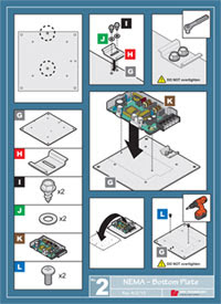 Infographics® APPROACH
Infographics toured the plant and made notes on the environment we found and the opportunities we saw to effectively present information to the assembly line audience. PIPS Technology had documented all the production steps and created temporary manuals for training, but they weren't completely convinced they were going to be an effective reference for the expansion of workstations, the new workers, or daily use.
Infographics implemented our own learning process by taking a hands-on approach. A member of our information design staff went through all the assembly process using the actual parts and tools to better understand the final product and to help our client identify the most critical and costly chances for mistakes. Infographics concluded that small full-color posters could be displayed strategically throughout the production areas to address the most "critical" steps.
Infographics presented a list of proposed visuals and together with the PIPS key production personnel concluded that we could address just two critical steps in the assembly of these products and create potential time and cost savings.
infographics® SOLUTION
- Develop wordless assembly steps and the graphics in poster form to give workers the information they need at a glance.
- Create a template for future applications that addresses four critical categories:
For more information, please visit info-graphics.com or call 865-588-9888.
- Orientation: An image or images that assure the worker he has the right part and is using it in the correct orientation for the assembly
- Parts: These images give the workers a visual check point for the parts needed.
- Assembly: Simple visual directions broken down into simple step-by -steps when necessary.
- Details: Simple reference to key details for clarity.
Wednesday, July 14, 2010
Thursday, May 27, 2010
Tuesday, May 4, 2010
Are bad instructions worse than no instructions?
We want to know your thoughts...are bad instructions worse than no instructions? Please post your comments here.
Tuesday, April 20, 2010
Wednesday, March 24, 2010
A little verification that what we do at Infographics matters
We recently completed some observational research with consumers and professionals to see how they install our product and the results were conclusive: We need better manuals!!!
Here are the takeaways from our research:
- Use consumer friendly terms
- Include more detailed diagrams/illustrations and exploded view images
- Design with larger fonts
- Define symbols and icons
- Use more white space, less clutter
- Review installation sequence and steps
- Consider preferences/needs of both “left-brained” and “right-brained” individuals
Monday, February 22, 2010
We couldn't have said it better ourselves.
Wednesday, February 10, 2010
Who wants to take time to read the directions? Let's just play!
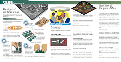 A few years ago, Infographics was asked to do a complete redesign of the playing instructions and develop a new Quick Start Guide for Hasbro's popular family game, CLUE. We take our jobs seriously, so in the spirit of good project analysis and evaluation, our employees spent an afternoon playing--I mean--working.
Whether it's a Quick Start Guide for a home appliance, a piece of machinery, or even a board game, the key to communicating relevant information with your intended audience is to literally put yourself in their shoes.
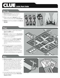 And that's what we do at Infographics. We play games, we install appliances, we take products apart and put them back together...all in order to deliver instructions that are easy-to-understand and applicable for the intended audience.
The goal of the new CLUE Quick Start Guide was to communicate the game summary and objectives (basically the Who, What, Where, and When) as well as the set-up and overview of basic game play rules. Realizing that simply playing the game often trumps reading lengthy explanations, we added "case file" headers and visuals in order to quickly share with players how to set-up, play, and win the game. The more serious players could refer to the Strategy Guide in the complete instructions for more detailed information.
Wednesday, January 27, 2010
Infographics' Client is Jumping into ABC's Shark Tank
 Knoxville businesswoman and Infographics' client Jill Quillin will appear on Friday's episode of ABC's reality series "Shark Tank." Quillin is the developer of LipStix Remix, which allows someone to mix colors and make a new tube of lipstick or combine old used tubes into one new full size tube.
On the reality show, Quillin approached a panel of well-established entrepreneurs, asking them to invest in her company. Quillin cannot say how her meeting went, although it will play out on national television this week. "I feel like I accomplished the world," Quillin said. "I was taking a risk just by getting in there. I was just thankful when I went through the door (to meet the panel)."
A little over two years ago, Quillin barely had the product completed when she started focusing on the instructions and contacted Infographics for help. "I knew the instructions would be critical to the success of customers keeping the product once they received it," stated Quillin. "After working so hard to acquire my customer, I knew a well-designed instruction sheet would be the best possible hope for my customers to stay 'in-love' with the product and have a positive experience using it."
Infographics' response: Whoever said that instructions have to be boring? Sometimes style is a significant consideration - even when it comes to instructions. According to Sara Christensen, Infographics' creative director, "we developed a two-tone retro look that was a major component of the design language for this project. Jill had a definite style of her own and we felt that style needed to be reflected in all communications related to her unique product."
"Infographics delivered in every aspect (design, copy, illustrations, etc.) and I can report that I have not had one return out of 1,000 systems sold to date!" said Quillin. "As an added bonus, the money I invested in my instruction sheet converted into a savings when I set up my company website as all the beautiful illustrations Infographics created were a perfect fit for my home page."
Friday, January 22, 2010
For What It’s Worth, Jim’s Two-Cents
According to the U.N. Program on Aging, one in ten people worldwide is now 60 years and older. By 2050, one in five will be 60 or older—and in more developed regions, it will be one in three. Even with increased social awareness of the need to serve an aging population, many companies still fail to understand how marketing specific information to better accommodate this population and making simple design changes can greatly accommodate older consumers.
Simpler easy-to-see, easy-to-use and understand product documentation IS a real need and too many product manufacturers cashing in on this growing demographic, are ignoring it!
I contend that a manufacturer of products for the older population could actually gain market share by having product documentation designed with their needs in mind by using it as a bonus product feature in their marketing. I say this not only because Infographics could help these companies, but because it hits home with me personally in dealing with aging parents and in dealing with age…"ahem"…myself!
For further reading on this topic, check out this article by Brand Channel: Engaging the Aging, Marketing to Europe’s Seniors.
Monday, January 18, 2010
Recent recalls on “How-To” home improvement books got us thinking.
It also prompted us to do a quick internet search to see if any other instructions had been recalled. According to the U.S. Consumer Product Safety Commission, just a year prior 64,000 Wiring a House instructional books published by Taunton Press were recalled for the very same reasons. Additionally, within the past year 18,000 illuminated round rocker switches sold by RadioShack Corp., were recalled because the wiring diagram on the switch’s package showed the neutral and line notation was reversed, posing a shock hazard to consumers. Stamina Products recalled 11,000 elliptical machines and modified the warning/assembly instructions in the owner’s manuals to emphasize that the elliptical pedal shafts must be securely tightened to the cranks. If not securely tightened, the pedal shafts could become loose from the cranks, which could result in serious injury to the user.
Our experience has shown that many companies fail to calculate, track or, even consider the cost of the risks they take by under-valuing the importance of the quality of their instructions. Risks that can take away those profits (for instance by recalls, unnecessary customer service calls) and result in the loss of market share, and more.
Many of our potential clients simply don’t budget enough money or time for their instructions (they seem to be an “afterthought” in the product development and launch schedule) and opt to spend the bulk of their money on sales support material. We understand that they are in the business to make money and selling the products is paramount to that concept. On the flip side, recalls like these are just one of many financial risks of underestimating the value of producing accurate and comprehensive instructions.
Why these particular instances happened and how these folks address it in the future must be identified before they can be avoided. It’s possible these “mistakes” stem from the lack of quality control and accuracy check points or the lack of physical testing of the instructions by actual users to verify them as accurate and safe.
Instruction manuals (and how-to books) continue to be, for many manufacturers, a requirement on which they invest a minimal amount of their product’s cost. For these publishers, the problem may have stemmed from common assumptions—the content and copy were fact-checked and proofread for spelling and grammar—the illustrators followed the experts' lead—therefore it must be right.
So what’s the answer? Hire the instruction experts? Partner with Infographics and they’ll do everything flawlessly? Now that’s a pretty big claim, and not one that many humans can or should make. What Infographics can offer are processes and collaborative ideas to substantially LOWER the risks of mistakes. We first recognize who the “content expert” is and it’s seldom us. Our niche is creating the means to communicate to other “non-experts”. We respect the manufacturer, engineer, product designer, scientist, inventor, researcher or writer (content experts) who provide the facts. We then respectfully challenge them and their content IF we don’t understand it ourselves right away. Combined with our skills in creating effective visual and verbal instructions, we can substantially lower the risks of mistakes.
Yes, we realize the experts know more than we do about their product/content, but WE need to understand it on our level to effectively communicate it to the audience who, like us, often does not have the expertise of the manufacturers and engineers. Once the content experts and our team come to an understanding based on our mutual respect of what we both do, the process begins.
We collaborate and create content for the end-users they can relate to and understand, and not necessarily in the way our experts can relate to all the time. To assure accuracy, both sides (experts/Infographics) stay intimately involved in making sure the content is accurate no matter how it is communicated—continuously pushing back on each other to make the information clear and accurate.
For the best results, we have our solutions checked by giving the instructional piece to a sampling of the targeted audience (by far the most important people in our process) to try to use and then critique.
The bottom line: Lowering the risks of recalls or injuries takes an investment too few are willing to make upfront. These recent recalls are examples of what NOT making adequate investments in instructions can cost for those who don’t.
Tuesday, January 5, 2010
Identifying moving parts and communicating motion with Infographics®
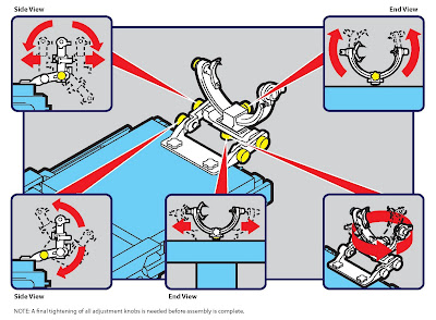 This week’s entry picks up on the concept introduced in our previous post—see Actually, it is brain surgery below—of using color to identify moving parts and communicate motion. Infographics developed a new quick reference guide for GE Healthcare that contains a series of sequence illustrations demonstrating set-up and basic functional processes. The reference step shown here was also included to quickly communicate different areas of articulation for the cranial clamp. These adjustments allow users to precisely position the patient for delicate surgical procedures. By using color and arrows, users get a quick visual reference to aide in making fine adjustments—which are critical in this application.
Quick reference guides have become a specialty of ours—communicating key information in a concise and visually-based form can make the difference between a positive experience and frustration.


